[Porto Seguro] Interactive Porto Insights - A Plot.ly Tutorial
[공지사항] “출처: https://www.kaggle.com/code/jundthird/kor-interactive-porto-insights-plot-ly”
Introduction
- Data Quality Checks
- Feature inspection and filtering
- Feature imporatnce ranking via learning models
import pandas as pd
import numpy as np
import seaborn as sns
import matplotlib.pyplot as plt
%matplotlib inline
import plotly.offline as py
py.init_notebook_mode(connected=True)
import plotly.graph_objs as go
import plotly.tools as tls
import warnings
from collections import Counter
from sklearn.feature_selection import mutual_info_classif
warnings.filterwarnings("ignore")
데이터 로드하기
train = pd.read_csv("./porto_seguro/train.csv")
train.head()
| id | target | ps_ind_01 | ps_ind_02_cat | ps_ind_03 | ps_ind_04_cat | ps_ind_05_cat | ps_ind_06_bin | ps_ind_07_bin | ps_ind_08_bin | ... | ps_calc_11 | ps_calc_12 | ps_calc_13 | ps_calc_14 | ps_calc_15_bin | ps_calc_16_bin | ps_calc_17_bin | ps_calc_18_bin | ps_calc_19_bin | ps_calc_20_bin | |
|---|---|---|---|---|---|---|---|---|---|---|---|---|---|---|---|---|---|---|---|---|---|
| 0 | 7 | 0 | 2 | 2 | 5 | 1 | 0 | 0 | 1 | 0 | ... | 9 | 1 | 5 | 8 | 0 | 1 | 1 | 0 | 0 | 1 |
| 1 | 9 | 0 | 1 | 1 | 7 | 0 | 0 | 0 | 0 | 1 | ... | 3 | 1 | 1 | 9 | 0 | 1 | 1 | 0 | 1 | 0 |
| 2 | 13 | 0 | 5 | 4 | 9 | 1 | 0 | 0 | 0 | 1 | ... | 4 | 2 | 7 | 7 | 0 | 1 | 1 | 0 | 1 | 0 |
| 3 | 16 | 0 | 0 | 1 | 2 | 0 | 0 | 1 | 0 | 0 | ... | 2 | 2 | 4 | 9 | 0 | 0 | 0 | 0 | 0 | 0 |
| 4 | 17 | 0 | 0 | 2 | 0 | 1 | 0 | 1 | 0 | 0 | ... | 3 | 1 | 1 | 3 | 0 | 0 | 0 | 1 | 1 | 0 |
5 rows × 59 columns
rows, columns = train.shape[0], train.shape[1]
print("The train dataset contains {0} rows and {1} columns".format(rows, columns))
The train dataset contains 595212 rows and 59 columns
1. Data Quality checks
Null or missing values check
train.isnull().any().any()
False
- null 값의 유무를 체크하면 False로 나오지만 데이터의 설명처럼 null 값은 -1로 표현되어 있습니다.
이제 어떤 칼럼에 모든 -1을 null 값으로 바꿔봅시다.
train_copy = train
train_copy = train_copy.replace(-1, np.NaN)
이제 null 값을 시각화하는데 유용한 Missingno라는 패키지를 사용하겠습니다.
import missingno as msno

msno.matrix(df=train_copy.iloc[:, 2:39], figsize=(20, 14), color=(0.42, 0.1, 0.05))
<matplotlib.axes._subplots.AxesSubplot at 0x1fa00508910>
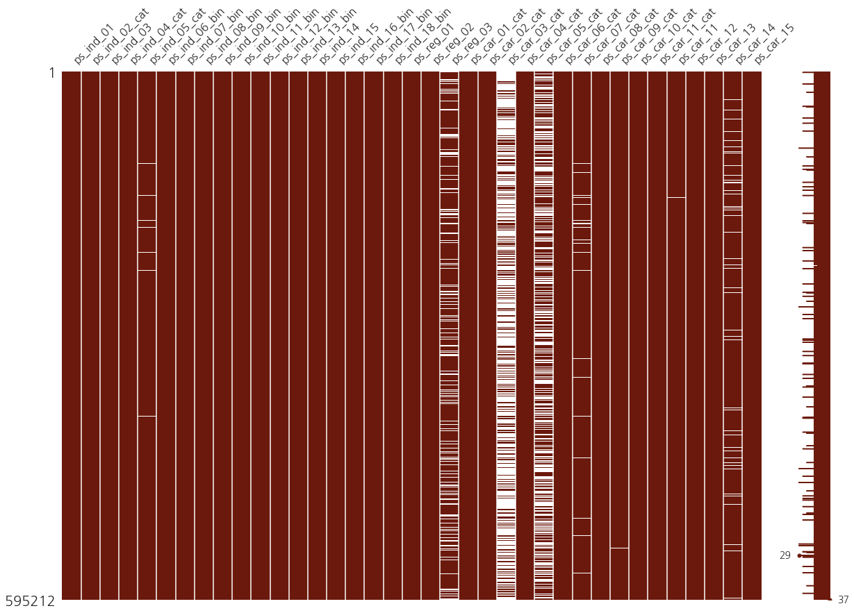
수직의 갈색 밴드에 겹쳐 놓은 흰색 밴드는 각각의 칼럼의 null 값을 반영합니다.
그리고 흰색의 비율에서 알 수 있듯이 3캐의 칼럼(ps_reg_03, ps_car_03_cat, ps_car_05_cat)은 null 값의 비율이 굉장히 높습니다. 따라서 이 세개의 칼럼에서는 -1을 null 값으로 바꾸는 것은 좋은 선택 같아 보이지 않습니다.
Target variable inspection
data = [go.Bar(
    x=train["target"].value_counts().index.values,
    y=train["target"].value_counts().values,
    text="Distribution of target variable"
)]

layout = go.Layout(title="Target variable distribution")

fig = go.Figure(data=data, layout=layout)

py.iplot(fig, filename="basic-bar")
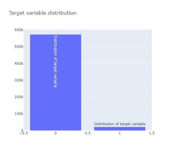
target 값의 분포가 매우 불균형한 모습
Datatype check
Counter(train.dtypes.values)
Counter({dtype('int64'): 49, dtype('float64'): 10})
train_float = train.select_dtypes(include=["float64"])
train_int = train.select_dtypes(include=["int64"])
Correlation plots
Correlation of float features
colormap = plt.cm.magma
plt.figure(figsize=(20, 16))
plt.title("Pearson correlation of continuous features", y=1.05, size=15)
sns.heatmap(train_float.corr(), linewidths=0.1, vmax=1.0, square=True,
            cmap=colormap, linecolor="white", annot=True)
<matplotlib.axes._subplots.AxesSubplot at 0x1fa14f677f0>
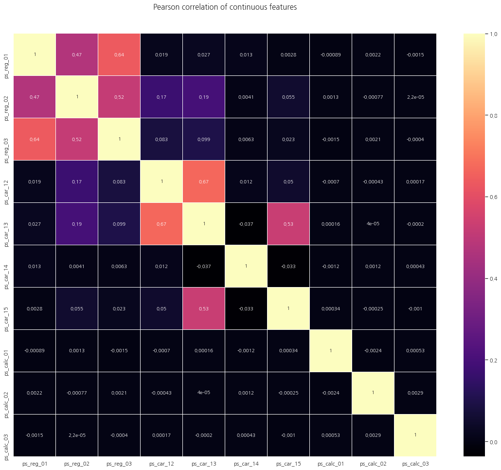
위의 heatmap에서 보듯이 상관관계가 거의 없거나 0인 많은 대다수의 칼럼을 볼 수 있습니다.
그리고 다음 칼럼들은 양의 상관관계를 가지고 있습니다:
(ps_reg_01, ps_reg_03)
(ps_reg_02, ps_reg_03)
(ps_car_12, ps_car_13)
(ps_car_13, ps_car_15)
Correlation of integer features
data = [
    go.Heatmap(
        x=train_int.columns.values,
        y=train_int.columns.values,
        z=train_int.corr().values,
        colorscale="Viridis",
        reversescale=False,
        opacity=1.0
    )
]

layout = go.Layout(
    title="Pearson Correlation of Integer-type features",
    xaxis=dict(ticks="", nticks=36),
    yaxis=dict(ticks=""),
    width=900, height=700
)

fig = go.Figure(data=data, layout=layout)
py.iplot(fig, filename="labelled-heatmap")
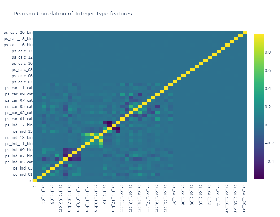
float 칼럼들과 마찬가지로 상당히 많은 상관관계가 0인 칼럼들이 관찰됩니다. 그리고 이러한 사실은 우리에게 유용한 정보를 줍니다. (PCA와 같은 차원축소는 어느정도의 상관관계가 필요하기 때문)
음의 상관관계를 가지는 feature : ps_ind_06_bin, ps_ind_07_bin, ps_ind_08_bin, ps_ind_09_bin
또 한가지 흥미로운 점은 null 값이 많았던 ps_car_03_cat과 ps_car_05_cat은 서로 강한 양의 상관관계를 지닌다는 것입니다. (null 값이 많기 때문에 데이터의 진짜 의미를 반영하지 못했을 수도 있습니다)
Mutual Information plots
상호정보량(mutual information)은 결합확률밀도함수 $p(x,y)$와 주변확률밀도함수의 곱 $p(x)p(y)$의 쿨벡-라이블러 발산이다.
- Kullback–Leibler divergence(KLD), 쿨벡-라이블러 발산은 두 확률분포가 얼마나 다른지를 정량적으로 나타내는 수치다. 두 확률분포가 같으면 쿨벡-라이블러 발산은 0이 되고 다르면 다를수록 큰 값을 가진다 \begin{align} KL(p||q) = \sum_{i=1}^{K} p(y_i) \log_2 \left(\dfrac{p(y_i)}{q(y_i)}\right) \end{align}
즉 결합확률밀도함수와 주변확률밀도함수의 차이를 측정하므로써 두 확률변수의 상관관계를 측정하는 방법이다. 만약 두 확률변수가 독립이면 결합확률밀도함수는 주변확률밀도함수의 곱과 같으므로 상호정보량은 0이 된다. 반대로 상관관계가 있다면 그만큼 양의 상호정보량을 가진다. \begin{align} MI[X,Y] = KL\big(p(x,y)||p(x)p(y)\big) = \sum_{i=1}^{K} p(x_i,y_i) \log_2 \left(\dfrac{p(x_i,y_i)}{p(x_i)p(y_i)}\right) \end{align}
# classification 문제의 경우 mutual_info_classif 메서드를 통해 간단하게 의존성을 확일할 수 있다.
# 이를 통해 target의 정보가 얼마나 많이 feature에 담겨 있는지 확인할 수 있습니다.
# sklearn에서의 mutual_info_classif 메서드는 knn에 기반합니다.
mf = mutual_info_classif(train_float.values, train.target.values, n_neighbors=3,
                         random_state=17)
print(mf)
[0.01402035 0.00431986 0.0055185  0.00778454 0.00157233 0.00197537
 0.01226    0.00553038 0.00545101 0.00562139]
mf = mutual_info_classif(train_int.values, train.target.values, n_neighbors=3,
                         random_state=17)
print(mf)
[1.17324892e-04 1.56675651e-01 1.38264284e-02 6.33430140e-02
 1.20309373e-02 2.38432030e-02 2.24765319e-03 2.25035654e-02
 9.11565941e-03 3.59334853e-03 4.86660151e-03 4.69728845e-04
 0.00000000e+00 0.00000000e+00 1.06237611e-05 1.16722719e-04
 1.12730906e-02 6.07922851e-02 2.43079030e-03 3.03500473e-03
 3.25141482e-02 9.46913756e-02 7.12840168e-02 4.18227160e-03
 3.96651850e-02 1.60587450e-02 1.17697679e-01 9.46544656e-02
 7.32462040e-02 1.32479615e-01 6.13151667e-03 5.78371607e-02
 3.17179532e-02 2.99441464e-02 2.89148620e-02 2.48357519e-02
 2.83918103e-02 2.77323698e-02 1.22966851e-02 1.51276513e-02
 2.67392155e-02 2.02287109e-02 1.27108353e-02 1.74897783e-03
 5.41632945e-02 4.23397318e-02 1.11210288e-02 1.64724962e-02
 3.22373254e-03]
Binary features inspection
bin_col = [col for col in train.columns if "_bin" in col]
zero_list = []
one_list = []
for col in bin_col:
    zero_list.append((train[col] == 0).sum())
    one_list.append((train[col] == 1).sum())
trace1 = go.Bar(
    x=bin_col,
    y=zero_list,
    name="Zero count"
)

trace2 = go.Bar(
    x=bin_col,
    y=one_list,
    name="One count"
)

data = [trace1, trace2]
layout = go.Layout(
    barmode="stack",
    title="Count of 1 and - in binary variables"
)

fig = go.Figure(data=data, layout=layout)
py.iplot(fig, filename="stacked-bar")
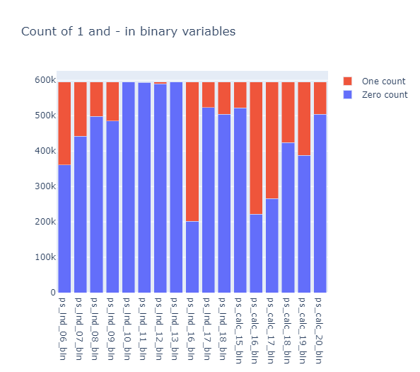
ps_ind_10_bin, ps_ind_11_bin, ps_ind_12_bin, ps_ind_13_bin 칼럼들은 0의 값이 대부분입니다. 위의 칼럼들은 target을 예측하는데 유용한지에 대한 질문을 던지게 합니다.
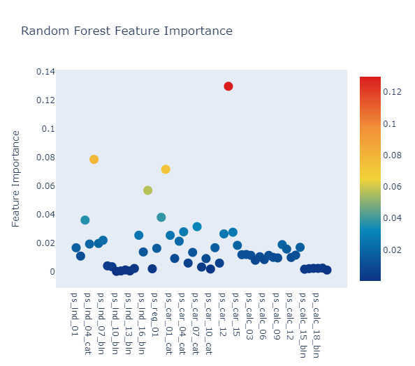
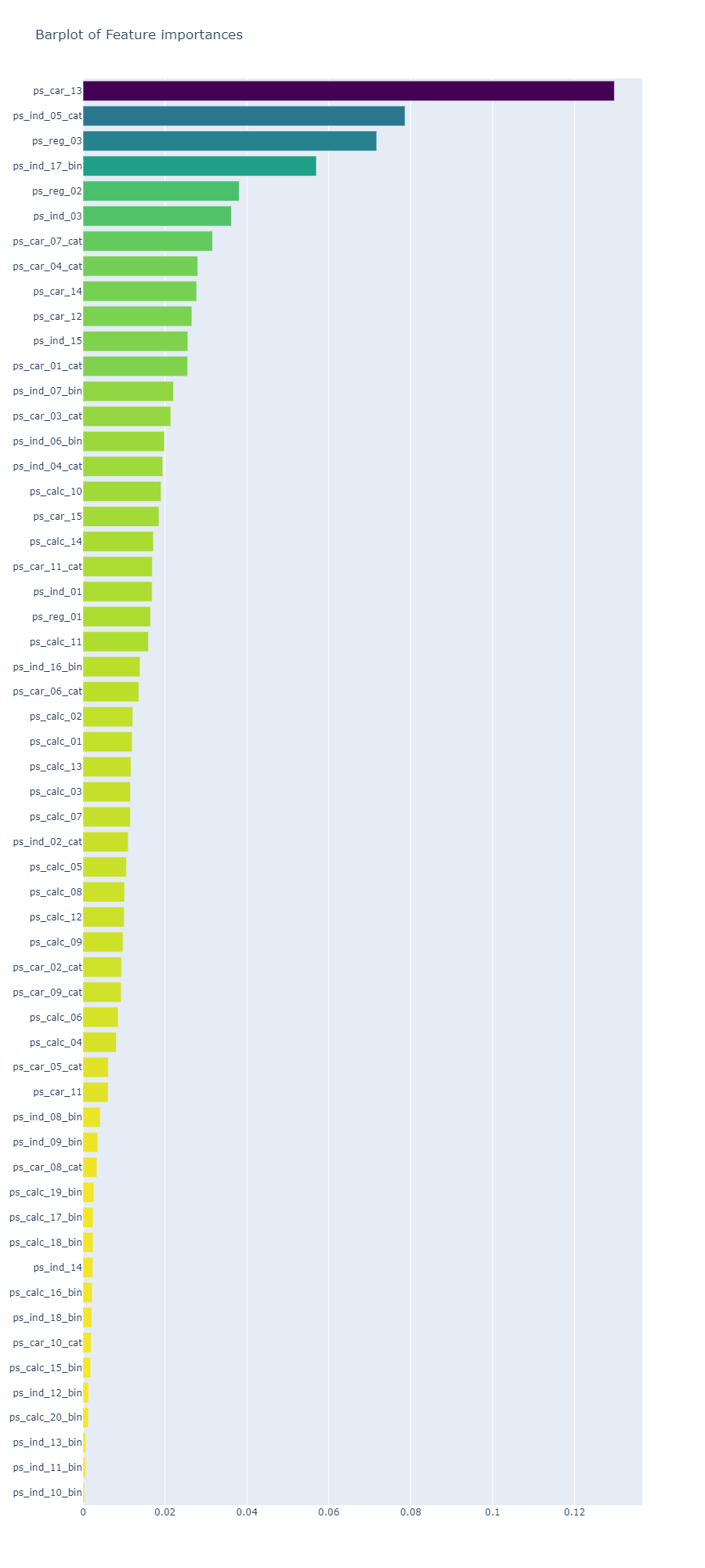
Feature importance via Random Forest
from sklearn.ensemble import RandomForestClassifier
rf = RandomForestClassifier(n_estimators=150, max_depth=8, min_samples_leaf=4,
                            max_features=0.2, n_jobs=-1, random_state=0)
rf.fit(train.drop(["id", "target"], axis=1), train.target)
features = train.drop(["id", "target"], axis=1).columns.values
Plot.ly Scatter Plot of feature importances
# Scatter plot
trace = go.Scatter(
    y=rf.feature_importances_,
    x=features,
    mode="markers",
    marker=dict(
        sizemode="diameter",
        sizeref=1,
        size=13,
        color=rf.feature_importances_,
        colorscale="Portland",
        showscale=True
    ),
    text=features
)

data = [trace]

layout = go.Layout(
    autosize=True,
    title="Random Forest Feature Importance",
    hovermode="closest",
    xaxis=dict(
        ticklen=5,
        showgrid=False,
        zeroline=False,
        showline=False
    ),
    yaxis=dict(
        title="Feature Importance",
        showgrid=False,
        zeroline=False,
        ticklen=5,
        gridwidth=2
    ),
    showlegend=False
)
fig = go.Figure(data=data, layout=layout)
py.iplot(fig, filename="scatter2010")
x, y = (list(x) for x in zip(*sorted(zip(rf.feature_importances_, features),
                                      reverse=False)))

# Barplot
trace2 = go.Bar(
    x=x,
    y=y,
    marker=dict(
        color=x,
        colorscale="Viridis",
        reversescale=True
    ),
    name="Random Forest Feature importance",
    orientation="h"
)

layout = dict(
    title="Barplot of Feature importances",
    width=900, height=2000,
    yaxis=dict(
        showgrid=False,
        showline=False,
        showticklabels=True
    )
)

fig1 = go.Figure(data=[trace2])
fig1["layout"].update(layout)
py.iplot(fig1, filename="plots")
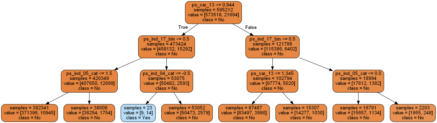
Decision Tree visualisation
from sklearn import tree
from IPython.display import Image as PImage
from subprocess import check_call
from PIL import Image, ImageDraw, ImageFont
import re

decision_tree = tree.DecisionTreeClassifier(max_depth=3)
decision_tree.fit(train.drop(["id", "target"], axis=1), train.target)

# 훈련된 모델을 .dot 파일로 내보내기
with open("tree1.dot", "w") as f:
    f = tree.export_graphviz(decision_tree, out_file=f, max_depth=4,
                             impurity=False,
                             feature_names=train.drop(["id", "target"], axis=1).columns.values,
                             class_names=["No", "Yes"],
                             rounded=True,
                             filled=True)


# jupyter notebook에 표시할 수 있도록 .dot를 .png로 변환
check_call(["dot", "-Tpng", "tree1.dot", "-o", "tree1.png"])

# PIL 라이브러리로 시각화
img = Image.open("tree1.png")
draw = ImageDraw.Draw(img)
img.save("sample-out.png")
PImage("sample-out.png")
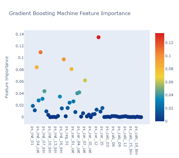
Feature importance via Gradient Boosting model
from sklearn.ensemble import GradientBoostingClassifier
gb = GradientBoostingClassifier(n_estimators=100, max_depth=3, min_samples_leaf=4,
                                max_features=0.2, random_state=0)
gb.fit(train.drop(["id", "target"], axis=1), train.target)
features = train.drop(["id", "target"], axis=1).columns.values
# Scatter plot
trace = go.Scatter(
    y=gb.feature_importances_,
    x=features,
    mode="markers",
    marker=dict(
        sizemode="diameter",
        sizeref=1,
        size=13,
        color=gb.feature_importances_,
        colorscale="Portland",
        showscale=True
    ),
    text=features
)
data = [trace]

layout = go.Layout(
    autosize=True,
    title="Gradient Boosting Machine Feature Importance",
    hovermode="closest",
    xaxis=dict(
        ticklen=5,
        showgrid=False,
        zeroline=False,
        showline=False
    ),
    yaxis=dict(
        title="Feature Importance",
        showgrid=False,
        zeroline=False,
        ticklen=5,
        gridwidth=2
    ),
    showlegend=False
)
fig = go.Figure(data=data, layout=layout)
py.iplot(fig, filename="scatter2010")
x, y = (list(x) for x in zip(*sorted(zip(gb.feature_importances_, features),
                                                            reverse = False)))

trace2 = go.Bar(
    x=x,
    y=y,
    marker=dict(
        color=x,
        colorscale="Viridis",
        reversescale=True
    ),
    name="Gradient Boosting Classifier Feature importance",
    orientation="h"
)

layout = dict(
    title="Barplot of Feature importances",
    width=900, height=2000,
    yaxis=dict(
        showgrid=False,
        showline=False,
        showticklabels=True
    )
)

fig1 = go.Figure(data=[trace2])
fig1["layout"].update(layout)
py.iplot(fig1, filename="plots")
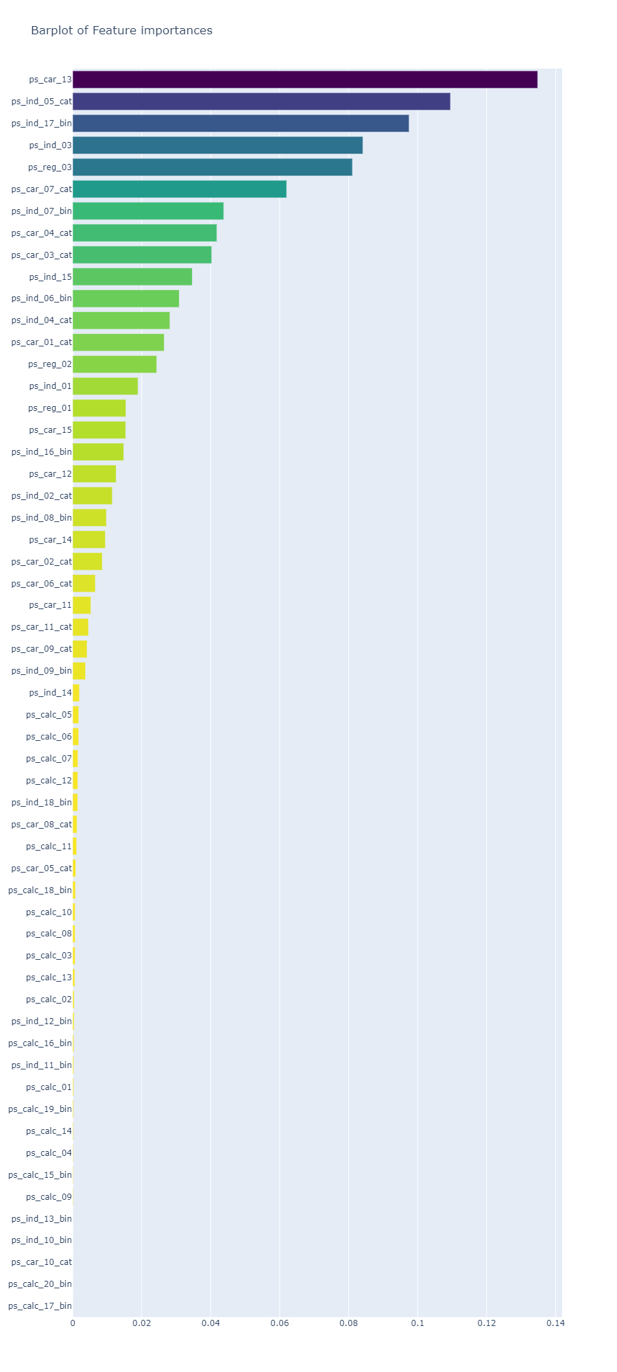
Random Forest와 Gradient Boosting 모델에서 가장 중요한 칼럼은 ps_car_13
Conclusion
null 값과 데이터를 점검하여 Porto Seguro 데이터 세트에 대해 상당히 광범위한 검사를 수행하고, feature 간의 선형 상관 관계를 조사하고, 일부 feature 분포를 검사하고 몇 가지 학습 모델(Random Forest, Gradient Boosting)을 구현했습니다. (모델이 중요하다고 생각하는 feature을 식별하기 위해)
참고: https://www.kaggle.com/code/arthurtok/interactive-porto-insights-a-plot-ly-tutorial/notebook
댓글남기기